Young Turks: An Entrepreneurship Branding

This year had been hectic, and at the same time, amazing for us! We had to do a cover art for an entrepreneurial book highlighting 10 best entrepreneurs in Coimbatore. You can read it off online, if you click the link below (it’s an android app):

https://play.google.com/store/apps/details?id=com.angler.youngturks&hl=en

Our content had been featured on a Times Of India article, and we couldn’t be happier. Here’s the initially planned cover featuring a sailer’s theme:

YoungTurksFinal

And here’s another one that didn’t see print:

YoungTurksForggy

And, here’s the one that was accepted:

YT

The only thing that kept us motivated is the overwhelming expectation from all the sides!

Mugathirai: A Short Film Poster

So, when I heard of this movie, all I wanted to do was in the minimalistic side. The crew was highly enthusiastic about me doing a vintage backed theme also, which in my opinion, highlighted the great taste they had.

So, here’s the poster for them that I did, after so many that were rejected:

FIN POS

Alright, the fun part’s after this. The film crew requested characterization posters, which I was more than happy to do in vintage hand-drawn designs, and here’s a sample:

MT1

Inspiring Quotes #2

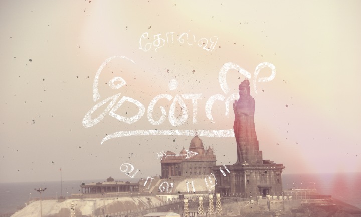
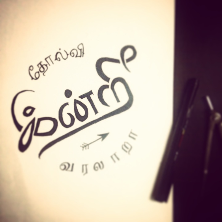
mnbforest-wallpapersWhen I sat down with a couple of fonts in Tamil (for this who don’t know, it’s probably the oldest language that exists) for samples, it was almost impossible, because unlike English types, it wasn’t easy to judge the letter weight and size. After several failed attempts, this is what I ended up with:

IMG_5422

Roughly translated, it reads: “Who doesn’t have a fight every day?” I have to thank Pa. Vijay, for his absolutely beautiful penning of the song, “Ovvoru Pookalume” from the movie Autograph. You can watch the song online, if you click here. And for the type “Porattam,” I had to watch the credits of the movie, “Veerapandiya Kattabomman;” thanks to them. 


My First Attempt At Hand-drawn Typography: You’d Be Surprised How Easy It Is

So, a very close friend of mine had just lost her dad to cancer and I wanted to present her something special. Initially, I wanted to do some fancy stuff to her dad’s pictures and give it to her, but then I remembered the vintage typography I recently fell in love with. I had already made up my mind by then, so I went out to get some pens, but the only one I could lay my hands on was a camlin black marker. So I bought one and a couple of Excel bond sheets and sat down to work. 

HOW I SELECTED A QUOTE:

We both read, watched and fell in love with The Fault in Our Stars, so I decided to pick up a quote from then. I had my eyes on this quote at first:

The Fault, Dear Brutus, is not in our stars, but in ourselves.

Okay, that was just stupid and will only irritate her more and then I had to watch the entire movie and finally picked this one up, because I thought it might give her something to be happy about:

I cannot tell you how grateful I am for our little infinity

INSPIRATION

Now it’s time for some good inspiration. I believe more in randomly selecting images, so I google things before settling down for a design. But this time, I knew who to look for: a community that call themselves GoodType. They had ultra good stuff on their profile, so it was easy to get inspired.

SO, WHAT I DID:

At first, I ended up with this and I even had the courage to scan it:

img001

Obviously, Illustrator rejected to do anything good with this, so I sat down to work on another design with few words, and I ended up with this:

IMG_5141 

I was actually happy with this, but I couldn’t scan it because I had to walk to shop and it was 11 in the night, so I took a photo on my iPhone and used illustrator to trace it for me. I was surprised how well illustrator could work with such a heavy image. A little bit of tweaks with photoshop and now it’s print ready.

GRUNCE INFINITYINFINITY GRUN

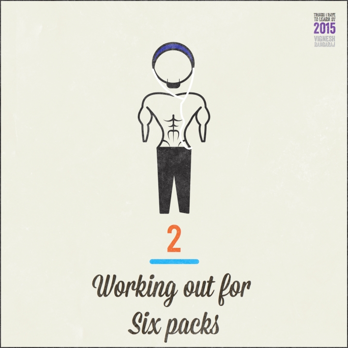
Things I Have To Do Within 2015: Working Out For Sixpacks

One thing I am absolutely trained for is six-packs; although I cannot maintain a diet as I would be mostly traveling for the rest of this year, I hope I get some time to do six-packs. The one thing that’s absolutely hard to get done is the lower abdomen; it kills  me. By the way, if you are like me, midway between skinny and athletic, you should check out Six-packs in 8 mins non-stop by some Spanish bloke on YouTube. Get shreddin’.

10570388_10152646893264578_1860274817992595895_n

Things I have to learn by 2015: Aiming Properly


I have always been very poor at aiming. Throw a beer bottle at me, you’d groan; throw a pen at me; you’d groan. All these make me realize I have very poor motor skills. So by 2015, I am learning to improve my skills at aiming. First off, I am buying a ball and throwing it against the wall and catch it back again.

To Do/ Check Off posts will keep coming.

AIM


What Makes You A Designer?

Honestly, I don’t know.

Designing is an everyday inevitable element in human life. If that’s the case, everyone’s a designer. You don’t need special talents to admire.

In my opinion, Admiration makes you good at something.

You have fall in love with something, at first, to be creative at it. A steaming mug of coffee placed against a rain-lashed glass window would make improve anyone’s moods. Designing is inspired by everyday elements such as these. You walk down a pathway of grey cemented pathways and brown concrete floor, your mind may immediately wish for a touch of yellow in those. Or you are sitting for your most boring classwork, and a pen and paper might bring great euphoria.

Successful designers have no secret formula.

Some designers like me just want to see how things work out. Reaching out to people in the form of art is an arduous task, and without designing, marketing would ease to exist. Just like fashion and entertainment, designing is ephemeral; it comes and goes. A good designer should never lose touch of present need in the market. As of 24 July, 2014, the trend is glancing back. Vintage is finding unforgettable corners of the streets and leaving permanent marks on visuals.

For a want of better word, I’m using “hipster,” as a defining word for an designer. He is the one who wakes up in the morning, puts on his best suit and goes in search for the missing color in the world.

Quite frankly, the ones who fins the missing colors quit working as designers.